Statistics
The 'Statistics' tab shows several statistics to determine the quality of the genotyping result of the selected locus, divided in 4 sections:
- Locus statistics
- Size distributions
- Nucleotide statistics
- Read QV
All graphs can be enlarged by clicking on it.
After enlarging, you can go back to all statistics graphs by clicking on the 'Back' button. 
After enlarging, it is possible in all graphs to zoom in by using the mouse wheel. By using the check boxes in the upper left corner, it is possible to fix one of the axes, while zooming in on the other.

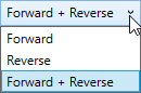
The graphs in the section ‘Locus statistics’ present the data of all reads as a default. By using the first pull down menu in the upper right corner, these graphs can also present the results of the only the forward reads or only the reverse reads.
For the graphs in the section ‘Locus statistics’ different views can be chosen by using the second pull down menu in the upper right corner:
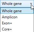
- Whole gene: the complete gene is shown.
- Amplicon: only the amplicon is shown.
- Exon+: only the exons plus flanking priority regions (including all splice sites) are shown. Priority regions are intron regions that enable correct identification of the presence or absence of particular null alleles.
- Core+: only the core regions plus flanking priority regions are shown. The Core+ region(s) are exon 2 and 3 for class I and exon 2 for class II genes, including flanking priority regions.
When the view is changed in the statistics view, the same view is applied in the alignment window.
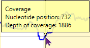
The graph 'Depth of Coverage' shows the number of reads per position.
The average, median, minimum and maximum read depth of the locus are shown on the left side of the graph. Ignored positions are displayed in grey at the plot.
The yellow boxes indicate the position of the exons.
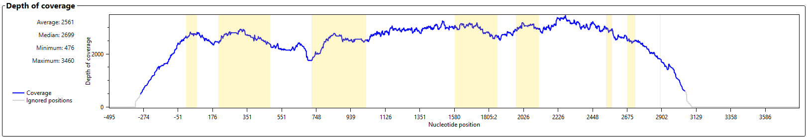
When this graph is enlarged, details per position can be made visible by clicking in the graph:
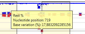
The graph 'Base variation' shows the heterozygosity for each position.
The yellow boxes indicate the position of the exons.
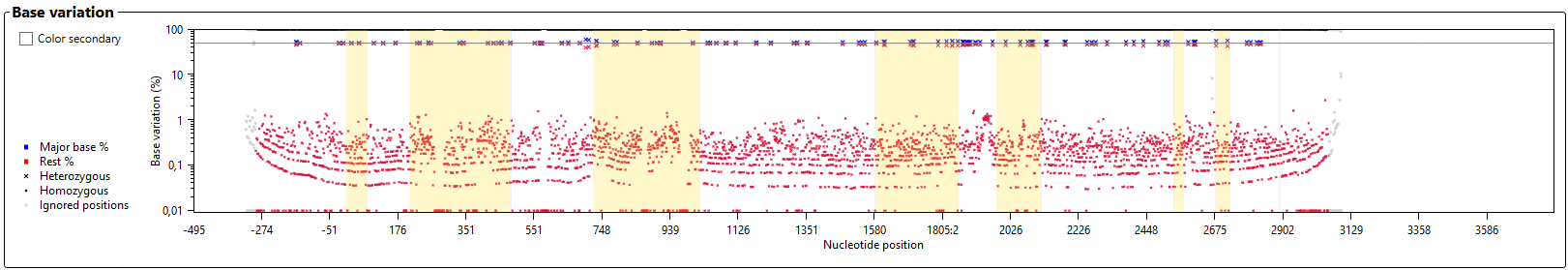
When this graph is enlarged, more details are visible.
Explanation of the symbols:
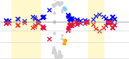
- Major base % and Rest %: Blue symbols indicate the percentage of the base that is called most frequent for each position. Red symbols indicate how often all other bases are called for each position. An ideal homozygous position will have a blue symbol at the 100% line. In many cases these will also have a red symbol at or below the 10% line, indicating noise (for example sequencing errors). An ideal heterozygous position will have a red and a blue symbol at (or close to) the 50% line (the thicker grey horizontal line).
- Heterozygous: All positions which have been called heterozygous are indicated by a large blue and red cross.
- Homozygous: All positions which have been called homozygous are indicated by a small blue and red cross.
- Question marks: The positions with a question mark are indicated by a light blue or orange dot.
- Ignored positions: The positions which have been ignored during analysis are indicated by a grey dot.
In the enlarged graph, details per position can be made visible by clicking in on one of the symbols:
When the check box ‘Color secondary’ is activated, all red symbols are replaced by green and orange symbols, where the orange symbol represents the frequency of the second most frequent base call and the green symbol represents the frequency of the rest (third and fourth). This option facilitates recognition of a potential third pattern in the data. For example, using this function it is very easy to discriminate a situation with 50% A and 50% T from a situation with 50% A, 25% T and 25% C.
The graph 'Insertions' shows whether any insertions are present that do not exist in the database.
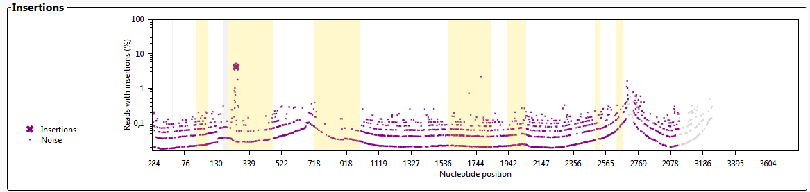
Insertions will induce noise in the alignment. When the noise has surpassed a threshold, this will be shown in the insertions graph as a large purple cross, indicating that the sample contains a putative new allele with an insertion. The graph shows the approximate location of the insertion, however, the exact location and sequence of the insertion have to be inspected by the user.
Insertions in "ignored" regions will not be shown.
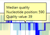
The graph 'Quality values' shows the median QV value for each nucleotide position of the locus.
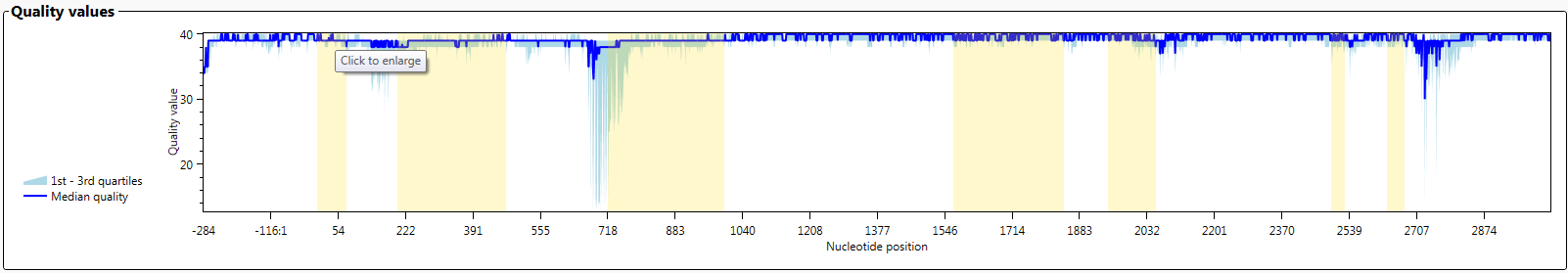
In fastq files, each nucleotide gets a QV value from the sequencer. After alignment, the median QV value for each position is determined. When you select 'Both' on the left side, you see the average of the forward and the reverse sequences. When you select 'Forward' you see the QV values of the forward sequences and when you select 'Reverse' you see the QV values of the reverse sequences.
When this graph is enlarged, more details are visible.
In the enlarged graph, details per position can be made visible by clicking in on one of the symbols:
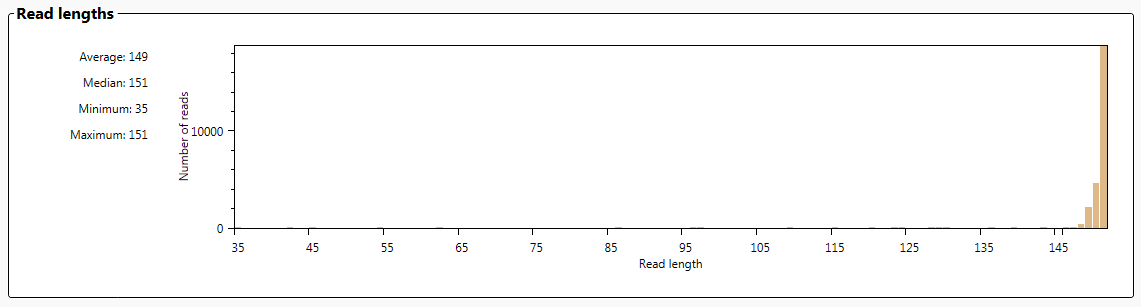
The graph 'Read lengths' gives an overview of the lengths of all reads.
The average, median, minimum and maximum read length is shown on the left side of the graph.
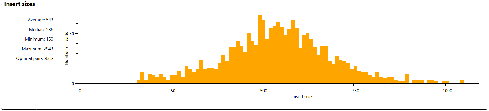
The graph 'Insert sizes' is shown if paired-end data is analyzed. It shows the length of all fragments that were sequenced, from the first nucleotide of the first sequence, to the last nucleotide of the paired sequence.
The average, median, minimum and maximum read length is shown on the left side of the graph.
The percentage optimal pairs shows the percentage of fragments which are longer than the length of the paired reads. For example: if you use the 2x150 sequencing kit then all fragments longer than 300 nucleotides are considered optimal, because no overlapping sequences are generated.
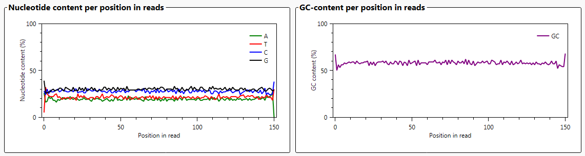
The graph 'Nucleotide content per position in reads' shows the percentages of each of the individual nucleotides for all reads.
The graph 'GC content per position in reads' shows for all reads, the GC content on each position.
In general, the GC content for HLA genes is a little over 50%.
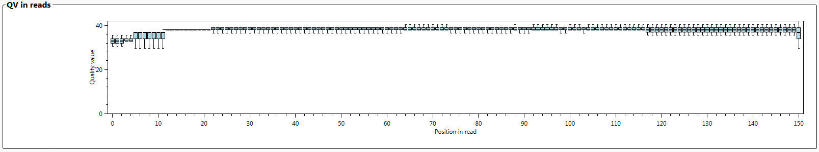
The graph 'QV in reads' shows the average QV values of each of the individual nucleotides for all reads. This graph gives an indication of the quality of the sequencing itself.